
“Any increase in wealth inequality or pre-tax income inequality in Britain or America is caused by the rich getting disproportionately richer, not by the poor getting poorer.” – Matt Ridley, “Start Spreading the Good News on Inequality,” Times (London).
From Pg. 107, A Fine Mess, T. R. Reid
Oh lol…Matt Ridley is delusional beyond belief. The simple fact that household debt in many of the advanced economies has been rising for most of the 1990s to early 2000s is the only reason that he could get away with such a massive lie.
The image below shows the evolution of debt as a percentage of disposable income from 1995 to 2017 for a few advanced economies.

If Matt Ridley was right, why was debt as a percentage of disposable income continuously rising in the advanced economies of the world (even those not included here)?
Let’s take a look at the growth of household debt as a percentage of income over that time. The linear trend lines are all positive, the USA is showing a barely positive rise but one needs to remember that the USA had the largest GDP in the world and only recently was overtaken by China (or equalled). So even the smallest of rises would be a large increase in numerical terms.

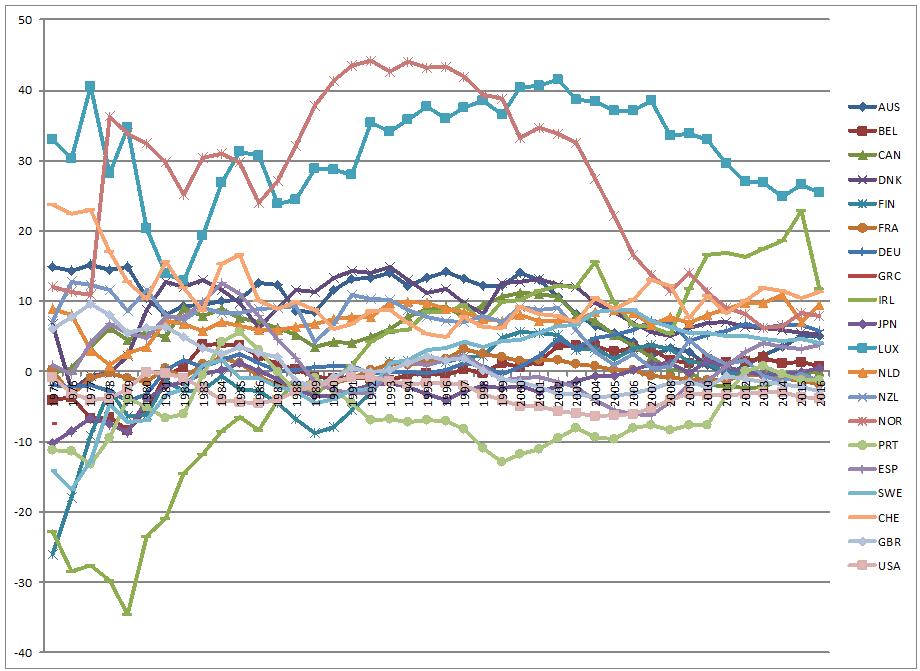
What does investment during the same, or similar, period look like? Here is the graph.

Looks like investment is cycling around a zero mean. If investment is averaging around a zero mean, then the increase in debt has to be shown somewhere. May be in household consumption.

I don’t know about anyone else, to me the two seem to be moving on their own, in other words, they don’t seem to be influenced by or influencing each other. An argument could be made that the size of investment may be too large for just consumer behaviour to have a sizeable effect on investment, that is a red herring.
The graphs are all of percentage changes, they should display some semblance of affecting each other. That, however, is not the case. Maybe something else was happening with the increasing debt.
What could the rise in debt be for then?
Was net trade seeing more imports than exports?
It seems that only Norway was seeing a consistent decrease in their net trade position while the others were holding steady or circulating about a mean with Canada showing a consistent growth of their net trade. Luxembourg consistently pulled in a large trade surplus. The same trend as the rise in household debt is missing in this case as well.
Could something else have been absorbing the increasing debt in a way that it was not being shown in the places that are accounted for?
Let’s check asset prices, like housing.

House prices were going up, that too rather steeply in some countries, in the period before financial crisis struck. Prices crashed right after the financial crisis with most prices increasing since then.
Most interesting thing to catch my eye, and a possibility that I had not thought of before, was that the linear trendline for Germany descends downwards. It suggests that the economy grew faster than house prices and could explain , maybe partially, why Germany was able to remain stable even as the recession decimated other Eurozone economies.
Let’s sum up the situation:
- debt rising,
- investment hovering around a zero mean,
- household expenditure not rising with rising debt,
- house prices were rising.
Sounds like the increasing house prices was absorbing a significant portion of the increasing debt.
Now the problem with this type of economic activity is that it creates debt, a lot of it, without leading to the creation of greater economic opportunities in the future. So eventually, the economy will stop growing simply because there is no idle capacity that growth will put to use. If this sounds like an argument in favour of the hoax referred to as “supply-side economics”, it’s not.
This is what happens when there is an unsustainable debt inflation in an economy that powers consumption more than it powers investment or expansion in productive capacity.
Eventually, when it’s time to pay the debt, the economy loses too much of the value produced to be able to fund growth and either stagnates or crashes. Keeping the debts in place for the future will cause the additional value produced being diverted to debt servicing and will cause further growth to be underfunded, which will be recorded as weak economic performance.
That is what many economies struck by the financial crisis of 2007 have witnessed.
The whole time I did not mention inequality and only focussed on economic growth and related facts.
That is exactly where increasing economic inequality hides – in economic growth and how it comes about.
How was inequality being hidden? The growing economy was taken as a sign that everything was healthy even as evidence emerged otherwise and many economists were sounding the alarm. All it takes is a Google search for “real estate bubble” for the period prior to 2005 (the full brunt of the bust was felt in 2007 with hints that the bust, or some huge slowdown in activity, had occurred in the middle of 2005).
How does growing debt point to growing inequality?
That’s easy. Find me one rational person willing to go more than 120% of their income into debt to fund any asset purchase.
So if the consumers were to not have indulged in debt consumption, then the economy might have displayed weakening performance soon after the 9/11 attacks in 2001. In other words, you had a debt financed bubble growing for nearly half-a-decade before it went bust.
Approximately 5 years is not a long time at all, except that in the information age, even one year can see a sectoral bubble grow to around 20-30% of GDP. The deflation of which will definitely lead to an economic contraction lasting a few years. In this case, the bubble had grown to several times of the entire world’s GDP before it went bust. No wonder the economies are barely beginning to recover after 10 years. Even as they recover, there is a massive hangover left because of the debt that was left intact to save the financial industry from the bad decisions they made to fund the bubble.
This episode of asset price inflation hid growing income inequality with a growing unsustainable debt bubble that left several economies in tatters and governments deep in the red as they raced to fund the banks involved in the entire process. Although, it seems economists are yet to have learnt from this catastrophic episode as they seem largely indifferent to growing income inequality.
Data used from OECD
1Household debt data: http://awlmajid.net/wp-content/uploads/2019/04/Household-debt-Total-of-net-disposable-income-OECD-1995-–-2017.xlsx
2Investment GCFC data: http://awlmajid.net/wp-content/uploads/2019/03/Investment-GFCFTotal-Annual-growth-rate-1975-–-2018.xlsx
3Data on household expenditure: http://awlmajid.net/wp-content/uploads/2019/04/OECD-2019-Household-spending-indicator.xlsx
4Net trade as a percentage of GDP: http://awlmajid.net/wp-content/uploads/2019/04/Trade-as-a-percentage-of-GDP-1975-2016.xlsx
5Housing prices data: http://awlmajid.net/wp-content/uploads/2019/03/Real-house-prices.xlsx